Ampryde
A sharp, quiet-power identity for a city e-bike brand, from the bolt mark to carousels, a ride film and the web.
- Client
- Ampryde Concept project
- Industry
- Mobility · Electric bikes
- Services
- Brand Identity SystemsCGI & 3D Product VisualsVideo Ad SystemConversion UX & Product Design
Concept project. Ampryde is a brand we invented and designed from scratch to show how our services work together. It is not a client engagement, so there are no client results to report.
The client
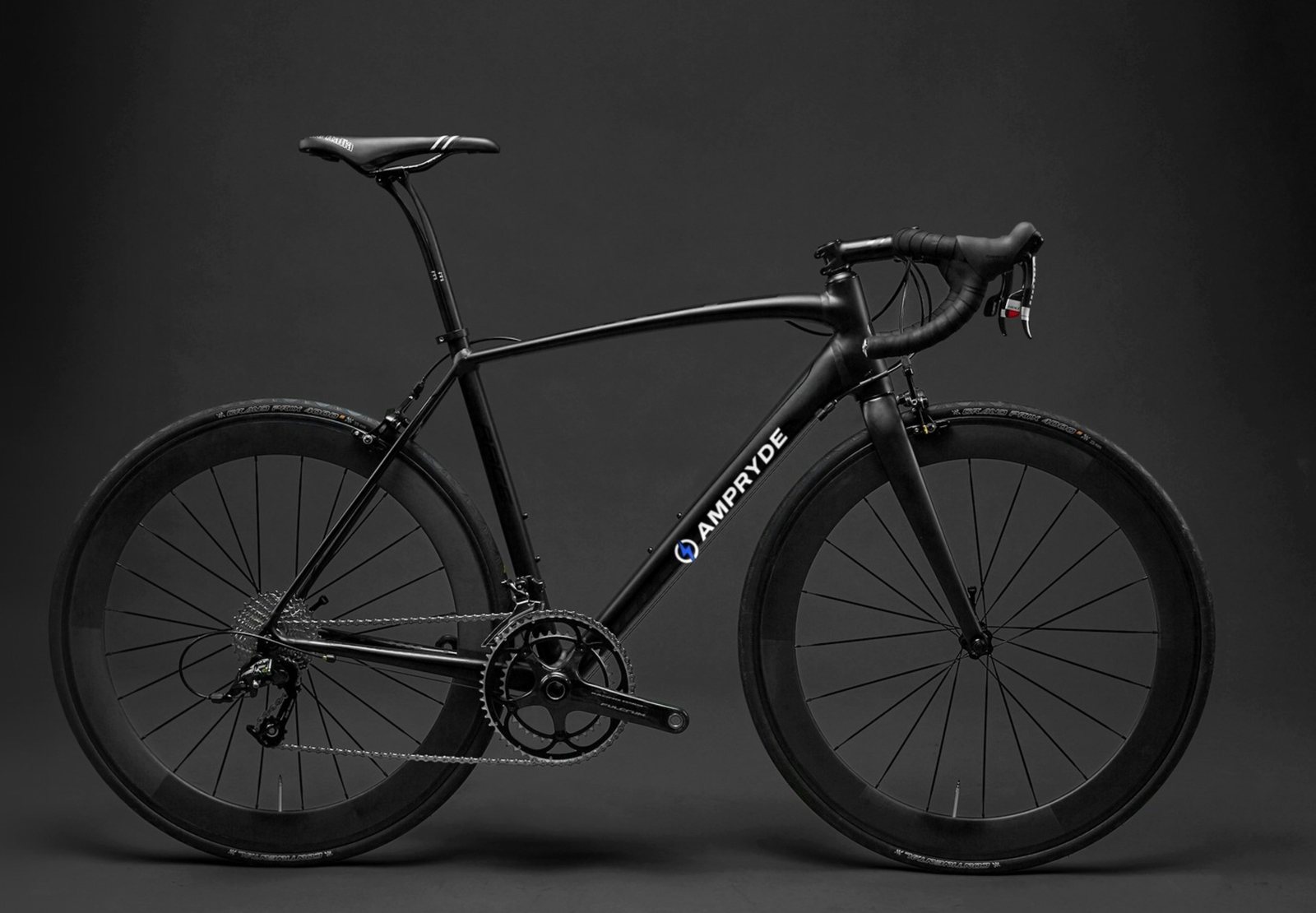
Ampryde makes light electric bikes for city riders, led by the Ryde One commuter and the Ryde Sport carbon model.
The challenge
E-bike brands tend to look either like sports gear or like gadgets. Ampryde needed to feel premium and calm, explain its specs simply, and give riders a reason to book a test ride.
Our approach
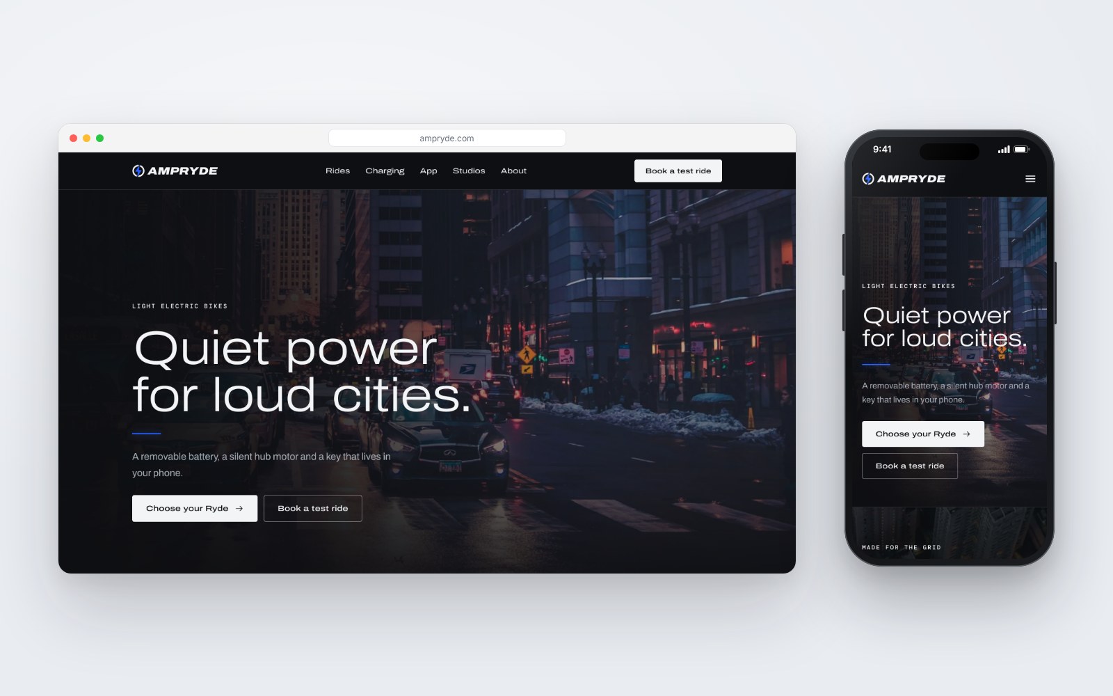
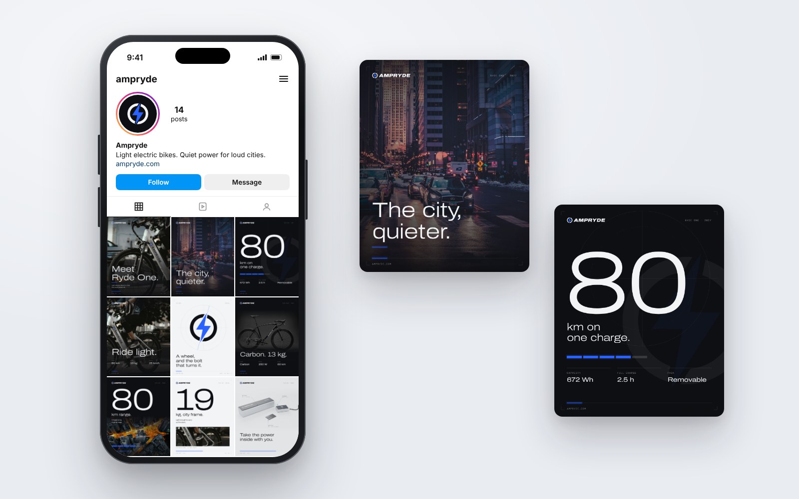
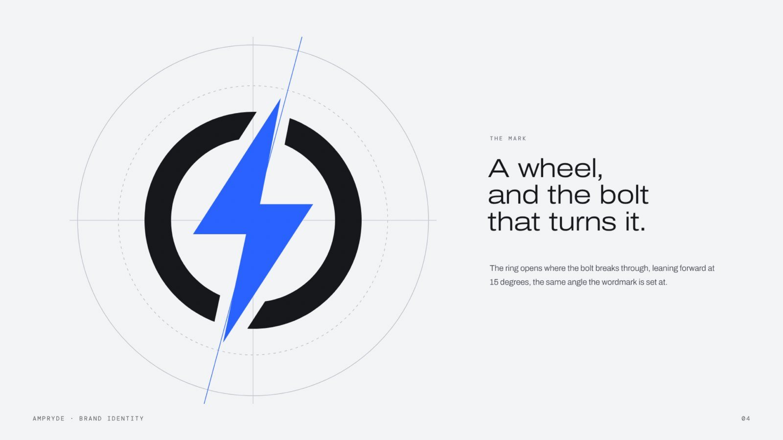
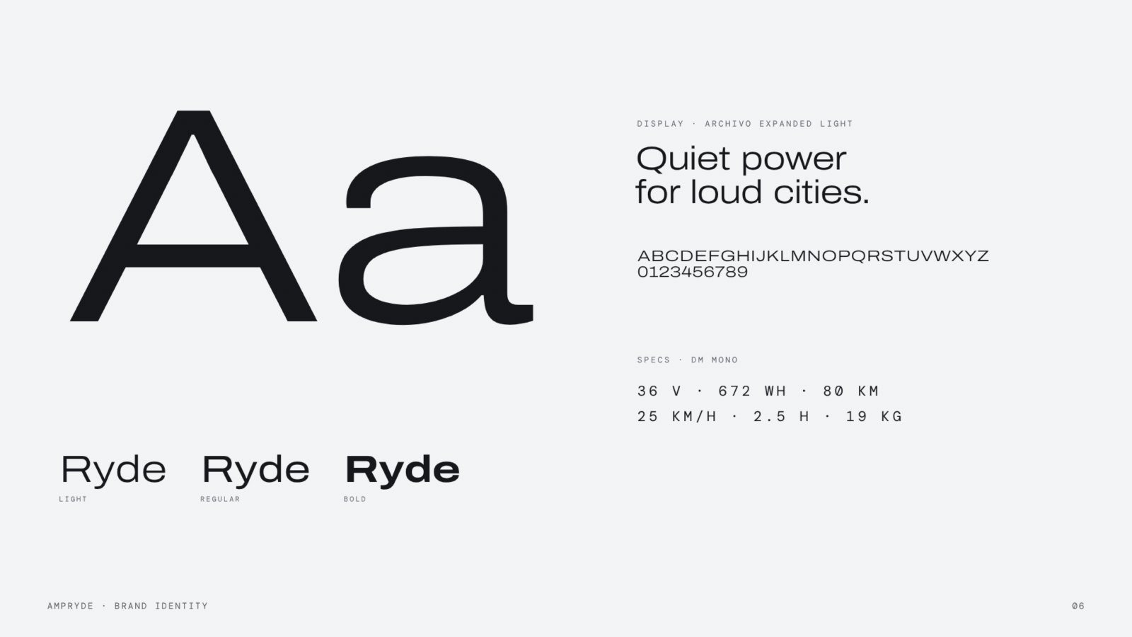
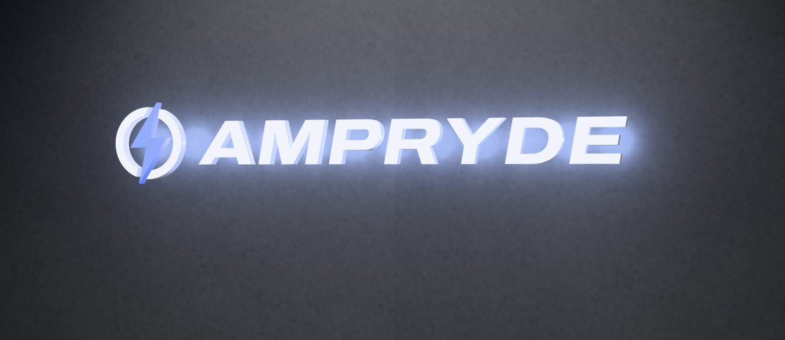
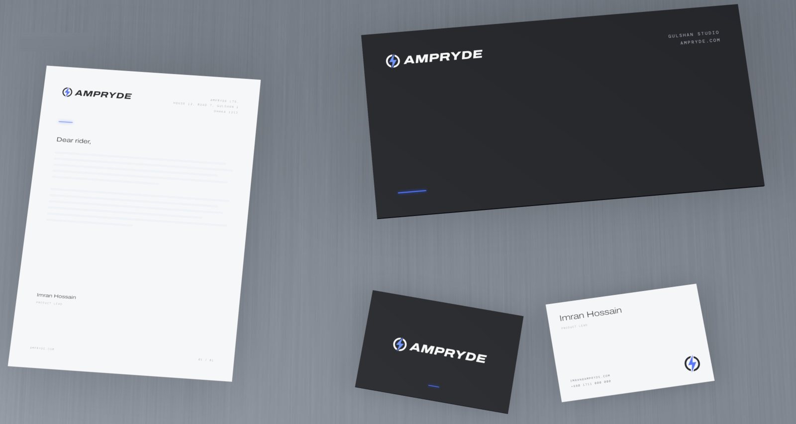
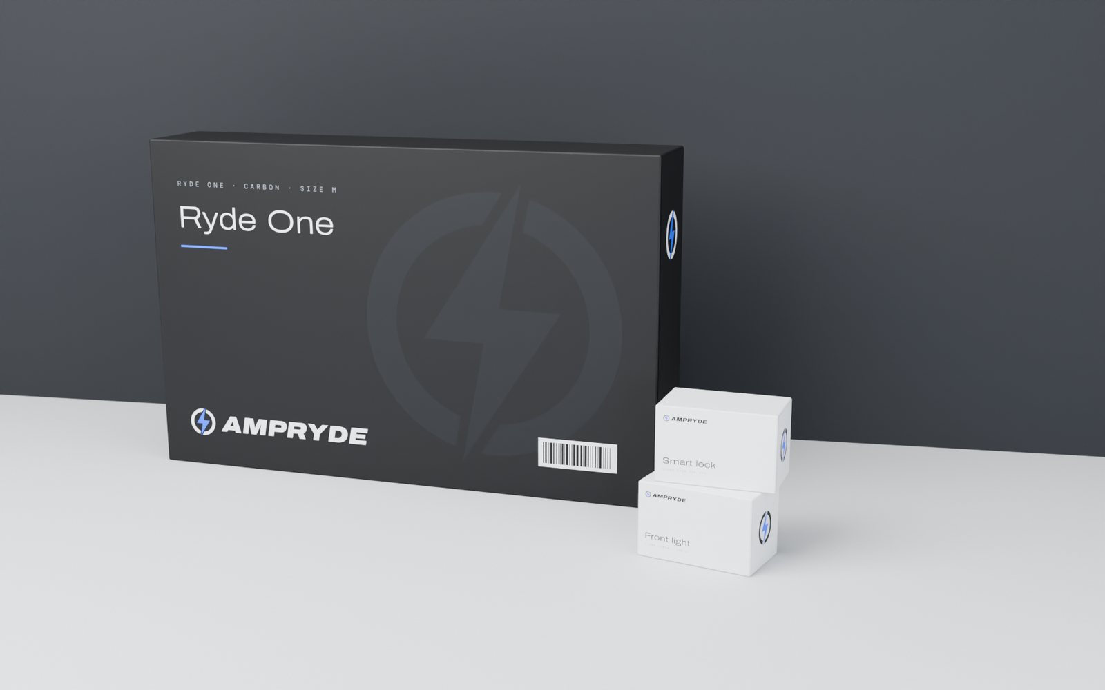
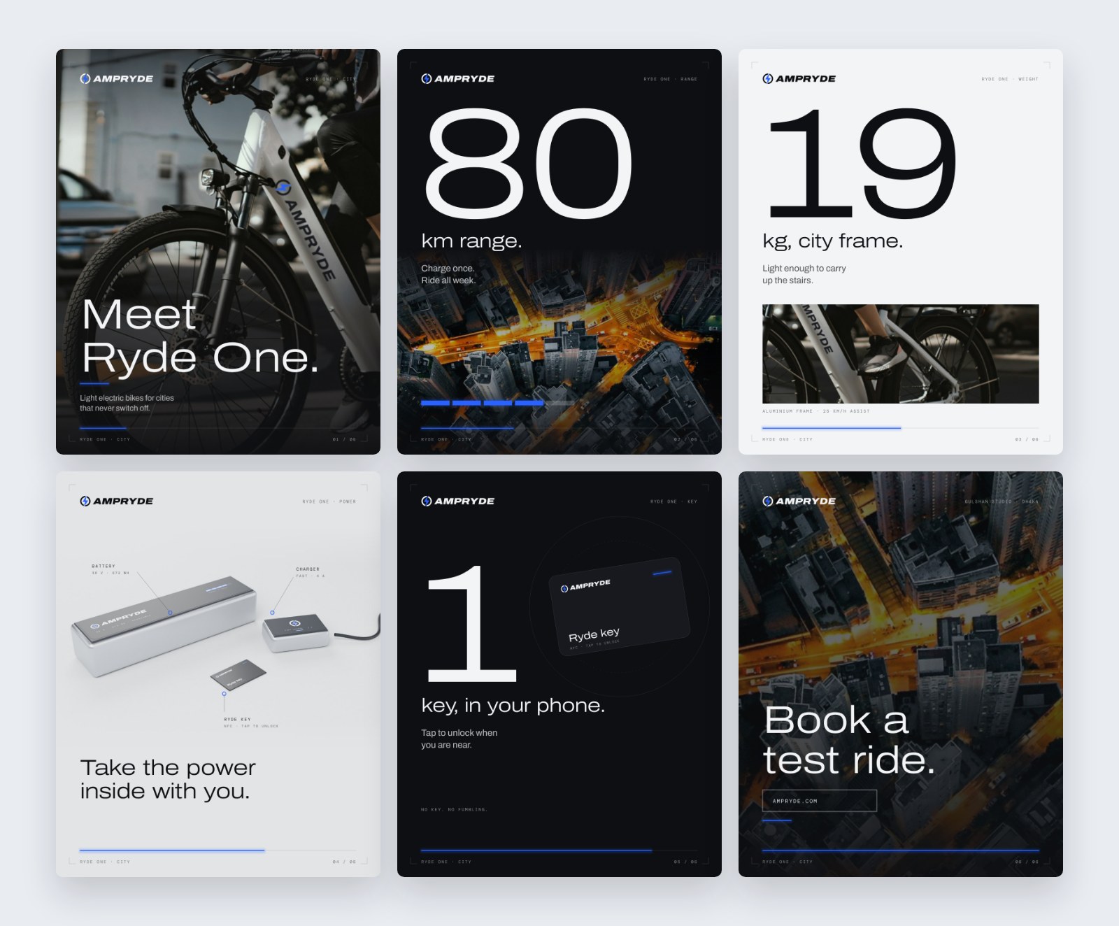
We designed a bolt-in-a-wheel mark with carbon, volt blue and ice, set in Archivo Expanded with 10° speed lines. Big numbers do the selling in carousels and posts. We added a ride film, product and packaging scenes, signage and a dark, cinematic website.
What we made
The bolt-in-a-wheel mark, a carbon and volt-blue palette, and speed-line graphics.
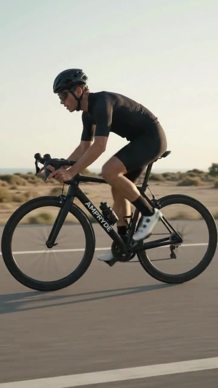
A ride film for vertical feeds, with spec-led posts around it.
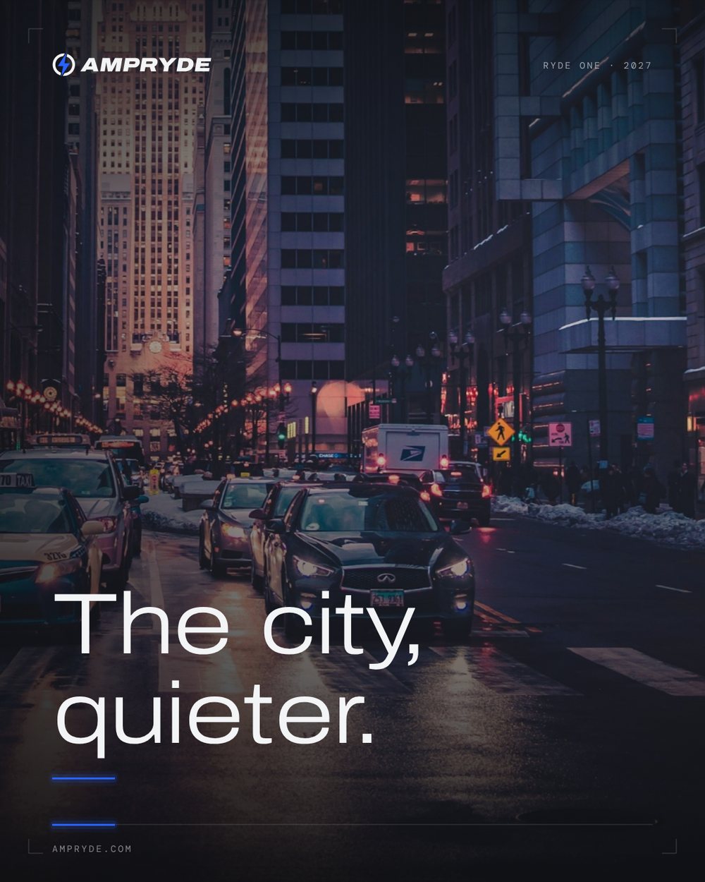
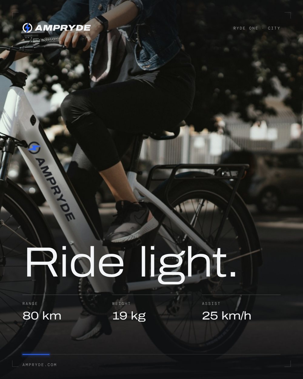
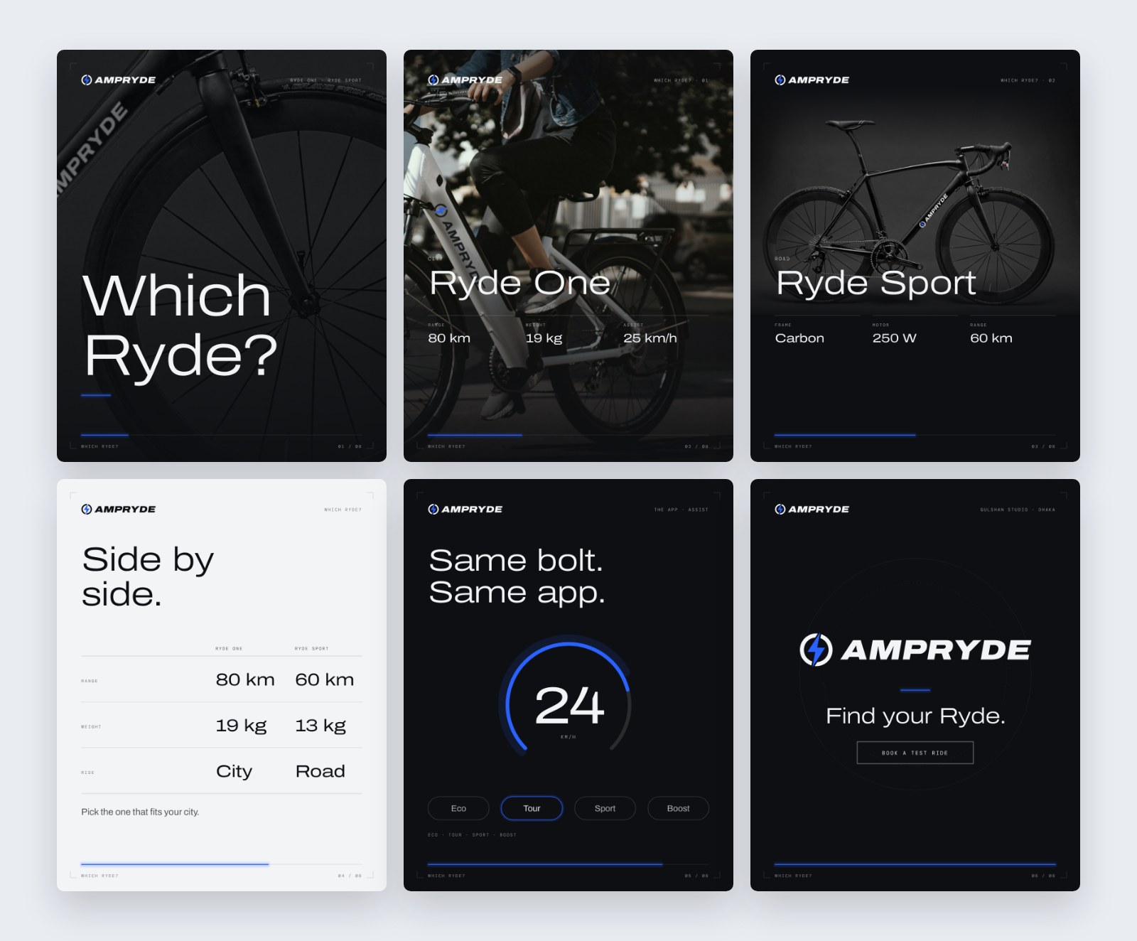
Two carousels: the Ryde One launch, and a guide to choosing your Ryde.
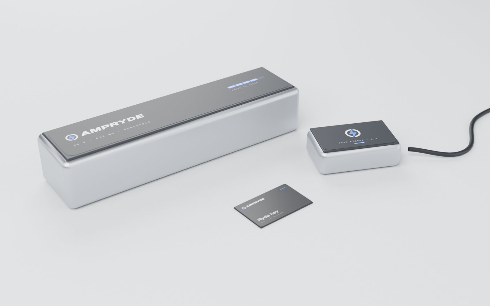
Product and accessory scenes for the range.
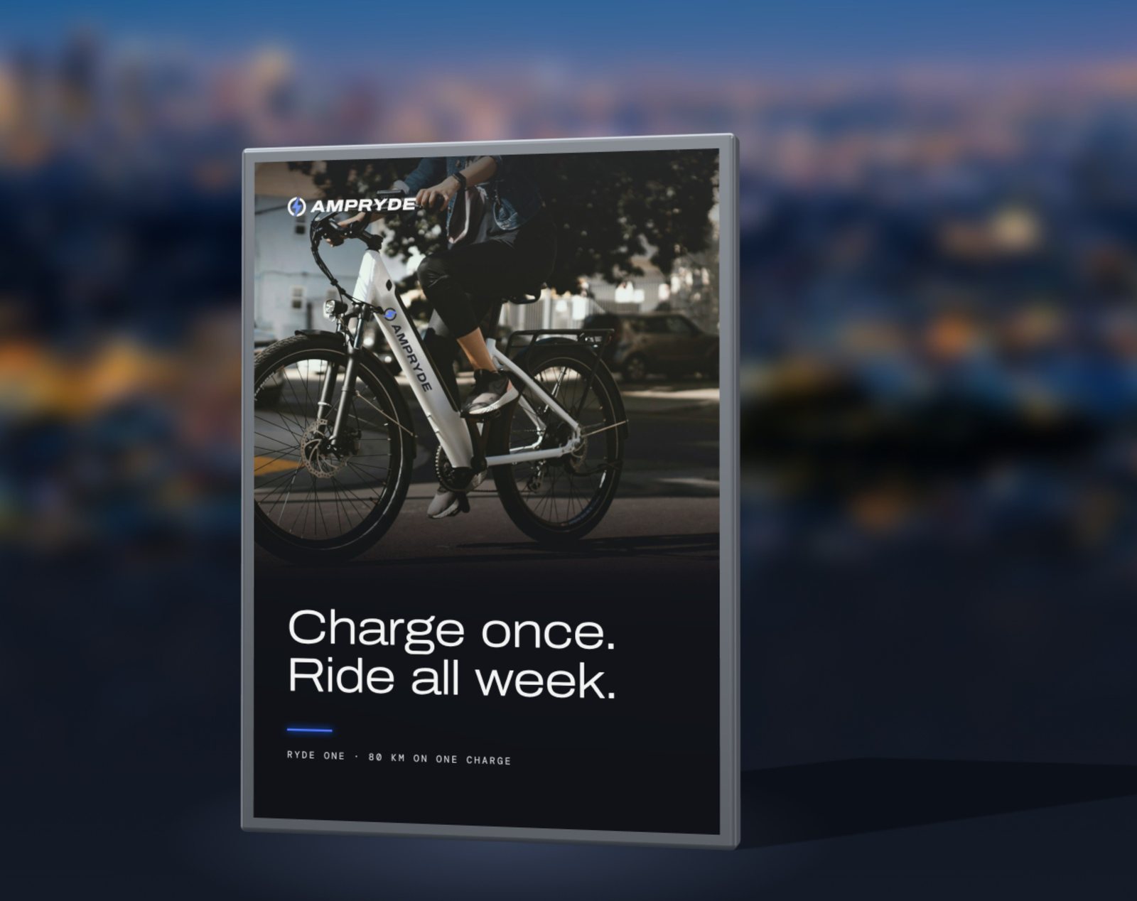
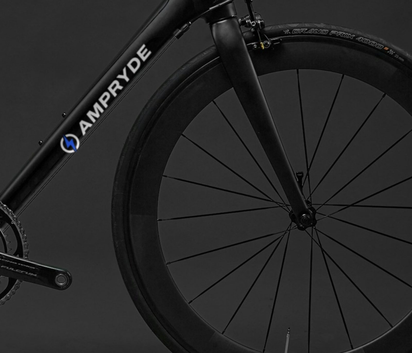
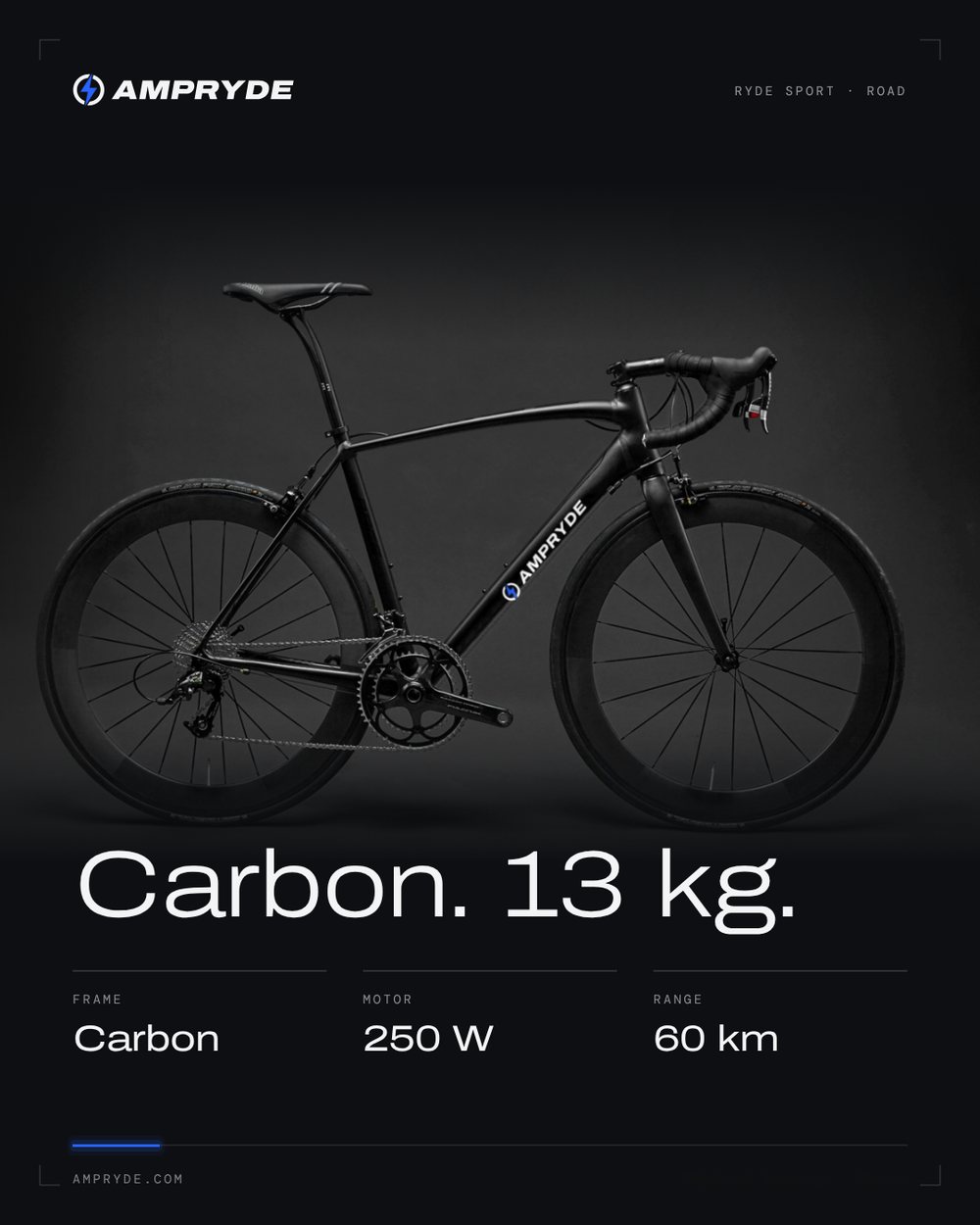
A dark, cinematic website and a social profile built around the specs.